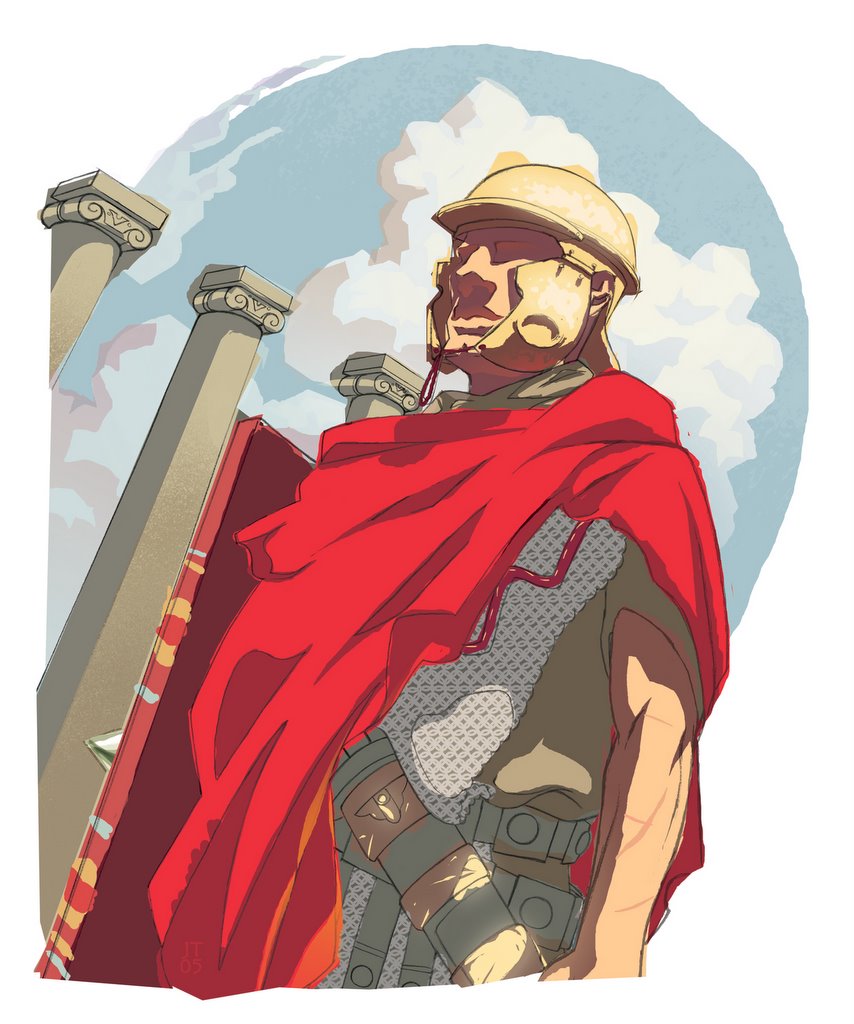
I always felt like there was more I could do with what I had for the Caesar cover (first post), so I drew in parts of the soldier that were missing (top of his helmet and his left arm) and made the piece into a vignette to open it up more. Did I take it too far? Please let me know what you think, I just had to do it and get it out of my system for good.
JT out.
4 comments:
hmm.. overall i like this one better but something seems off about his arm, maybe like its too small or something like that
i think the arm is fine, but the sky should maybe drop behind and around it, to draw the attention away from it and back to the illustration
i think the arm is fine, but the sky should maybe drop behind and around it, to draw the attention away from it and back to the illustration
Thanks for the input bros. I tried a version where I increased the size of the arm and torso but it looked worse; Pat, I think your suggestion would probably be a better solution. I'll give it a shot and post it if it looks nice enough.
Post a Comment